I am a bit late to say this, but since this is my first post of the year, here it goes: Happy 2021! The beginning of the year has been somewhat chaotic around the world, but the prevailing feeling is that things are slowly getting better. While in lockdown keeping myself and others healthy, I had the opportunity to work in our atrial computer model and tackle some new challenges there.
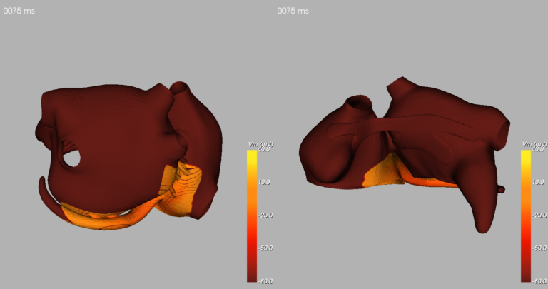
In the last month, we introduced some anatomical changes to our model to make it more realistic and possibly generate signals more like those of atrial fibrillation in clinical practice. This motivated our group to update many of the software we use to generate new models, which is great, but came with a cost: some visualization tools we had to make nice images such as those seen here were no longer functional. This means I had to face the challenge of finding new ways to visualize the data generated by our model.
The objective of visualizing data is to make the information it contains more intelligible for us humans. This ranges from graphical representations of signals over time up to multi-dimensional datasets. Luckily for me, the visualization of the model data only has three-dimensions (the geometry) over time, making this a relatively straightforward problem.
When it comes to tridimensional visualization and programming languages, probably everyone who searched a bit about the subject came across VTK (Visual Toolkit). This is a very nice open-source library with tons of useful functions, but it is so extensive that it is sometimes very hard to understand what is what.